When building your brand’s identity, think of this as the visual representation you wish to be perceived by your ideal clients. Your visual identity is the face of your brand and a well-developed foundation allows you to clearly communicate with your target audience.
When building out these elements, the goal of a comprehensive identity is to connect and reinforce an emotional connection and positive feeling towards your brand. This requires depth and a cohesive thread implemented across all your marketing touch points. These collective elements are defined as the logo, sub-marks, color palette, mood, imagery, typography, patterns, illustrations and brand voice that define your identity and set the tone for all your marketing and collateral.
Creating a fully defined visual story is essential to achieve a cohesive look and feel of your brand. Inconsistent elements can cause confusion and lead to a lack of trust for potential clients. In contrast, a thoughtful brand with consistent execution evokes a positive emotional response leading to a more authentic connection. Customers investing their valuable time and money are drawn to brands fostering connectivity and a true relationship built on trust. Using thoughtful branding elements convey your values and intention while also building loyalty with your customers.
BRAND ASSESSMENT
To get to the heart of your brand’s visual story, we dive deep into what makes you truly unique. We do this with strategic questions, with our Brand Discovery process, to facilitate a self-analysis on your part of your unique positioning, both where you feel you currently are and where you’d ultimately like to be. Based on this assessment, we then develop a visual story that positions you in the most meaningful way to your ideal audience.
After completing the branding process with Honor, we deliver your arsenal of brand assets with a personalized Brand Guide that defines each of these elements and the best way to use them. We further use these brand elements when designing your website, printed collateral, digital marketing materials and more. Utilizing these assets correctly and consistently will elevate your positioning and enhance brand recognition. Although each branding project is unique by nature, here are Honor’s most commonly used elements:
LOGOS + SUBMARKS
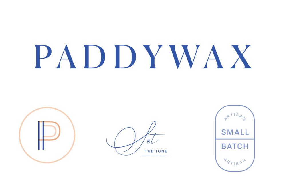
Think of your logo as the lead character of your brand. It’s instantly recognizable and distinctive, but it doesn’t need to tell the full story. That’s where your secondary logo and sub-marks come into play. These elements add detail, depth and versatility to bring your brand story to life.
Through the Brand Assessment exercise and thoughtful approach to bringing a brand’s story visually to life, we identified a couple of key areas to bring Paddywax’s purpose “to sets the tone in your home” and long-standing history of hand-pouring candles since 1996 into their brand identity.
COLOR
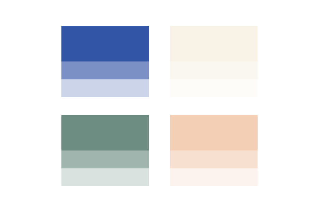
Color theory plays a significant role in driving consumer behavior. Colors are one of the easiest ways to evoke a feeling from your consumer. A comprehensive palette supports the overall brand message. What we’re looking to achieve through our Brand Discovery process is to understand and align your brand’s values to create a palette that supports and evokes the right emotions to support the visual style we are defining.
Color is very meaningful to Paddywax and is one of their most important core values as a brand, therefore, creating a versatile, colorful palette for Paddywax brand was a no-brainer to convey the creative, artisan approach they take with their candles, vessels, packaging and beyond.
MOOD BOARD
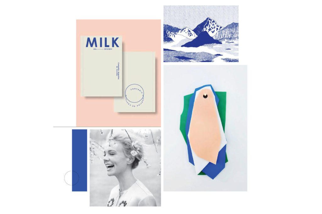
Your photographic styling includes lighting, hues, background, subject matter, models, visual references, and environment which all need to make sense and blend cohesively with your color palette. These images are meant to be an inspiration and to give you criteria and guidelines for your graphic direction moving forward.
IMAGERY
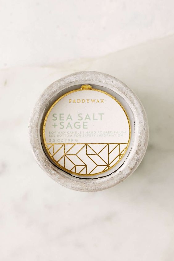
Imagery is one of the most important aspects of your overall brand. Compelling brand imagery speaks for you—starting a conversation that sparks curiosity and imagination. From your website to blog to packaging, stationary, marketing and everything in between, images capture the essence of your business and are a real asset to your brand.

TYPE
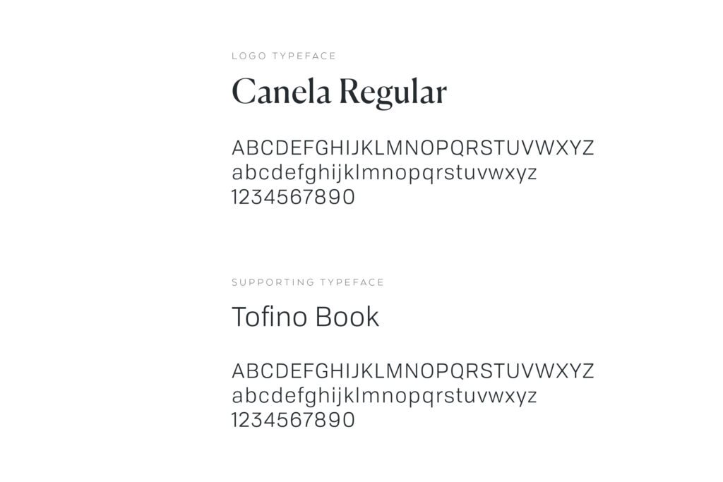
The font families chosen for your brand add character and enhances your brand’s personality. Your typography reflects whether you’re seen by your potential audience as modern vs. traditional, bold vs. feminine, or playful vs. sophisticated. These selections have an emotional impact with your audience and we want to ensure we’re making the right first impression.
PATTERNS + ILLUSTRATIONS
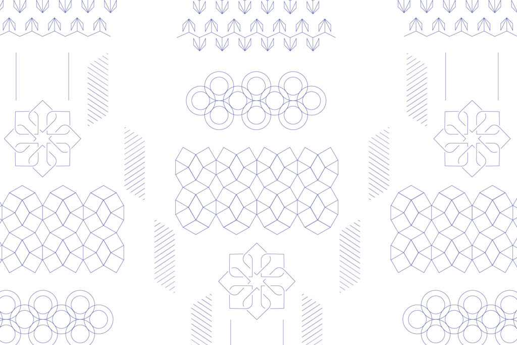
This is another key area where Paddywax’s core values of versatility and creativity really shine. Patterns and illustrations add texture and flair and another layer to your brand’s visual mood and personality. These elements aren’t a necessity to your branding, but can add versatility to your website design, packaging, social icons and collateral, and even on the back of your business cards.
THE FULL BOARD
