Le Chacuel is a modern rental property located in the Mojave desert perfect for hosting events or escaping from city life. With unobstructed views of the wondrous landscape and luxurious amenities, there is no better place to re-center with nature than this exquisitely designed home.

CONCEPT
For this project, we worked with the client to create a unique brand for the property as well as a show-stopping website to help increase traffic. For both the branding and the website we wanted to create a luxurious feel with a modern flair. The designs are meant to reflect the essence of the property which is unique and hand-crafted, while the website should allow visitors to easily fall in love with the space and encourage bookings.
THE BRANDING PROCESS
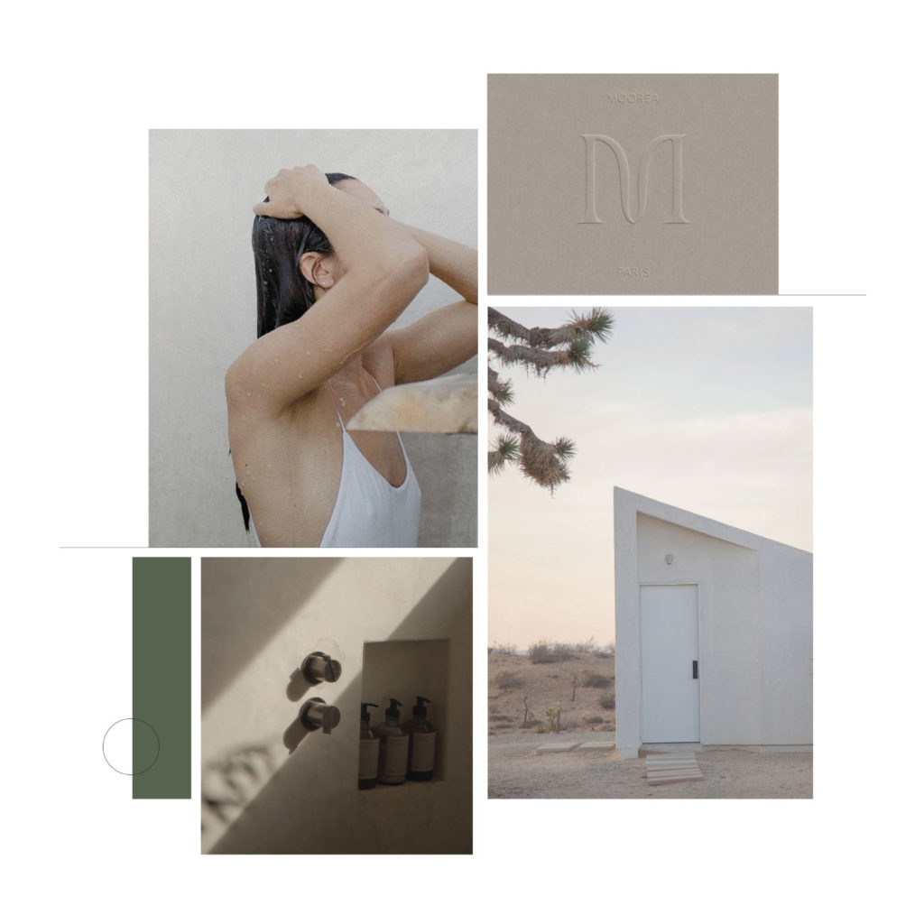
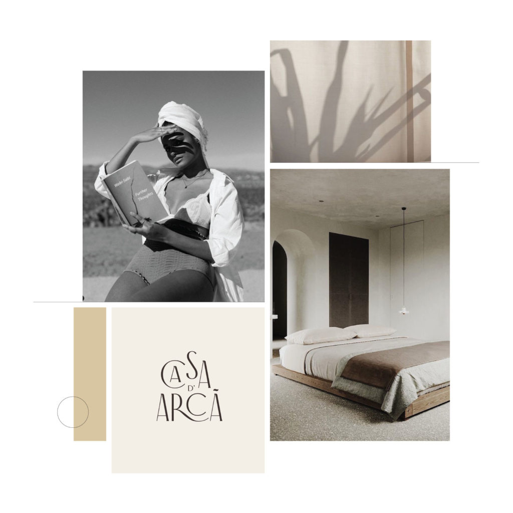
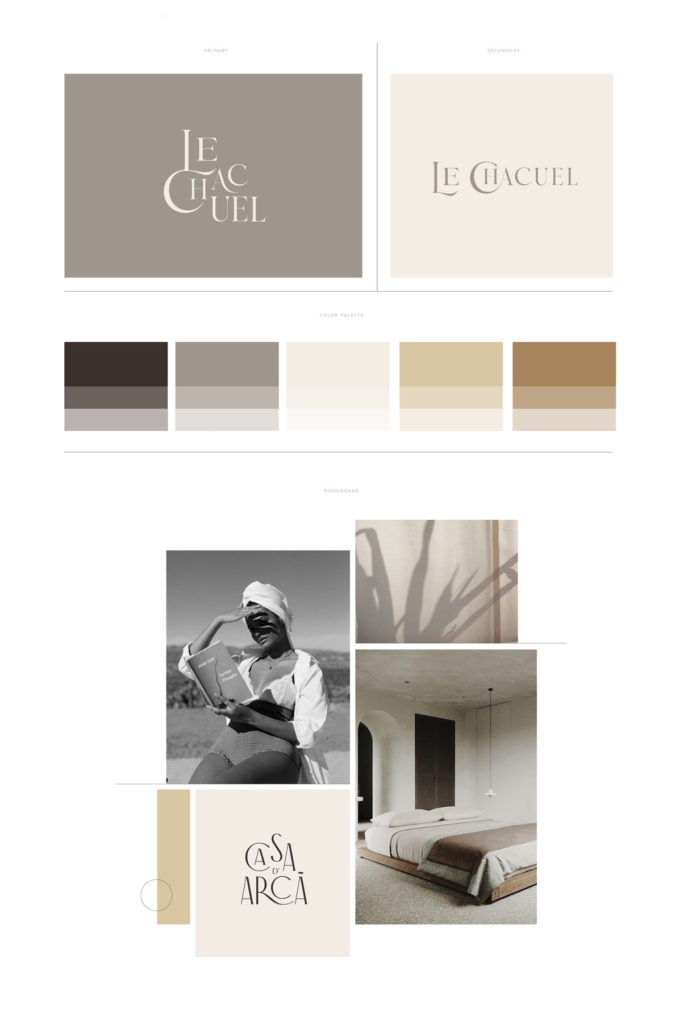
The process we used for Le Chacuel was slightly different than our normal branding process. After a few conversations with the client and a deep dive into the essence of the property, we provided two brand directions to choose from. Each showcased a different mood board, color palette, and abbreviated logo system, but still exuded the restful, modern, and luxurious aspects of the home. We drew inspiration from the Mojave desert and the modern, custom furnishings of the property.


Images Sourced from Pinterest.
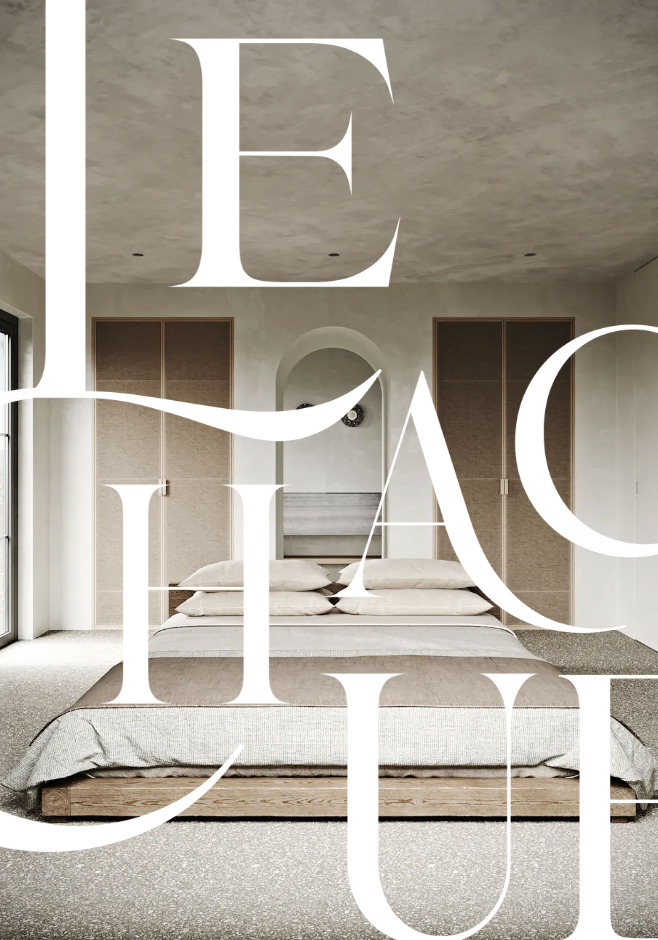
The client ended up choosing the more neutral desert-focused brand direction to showcase their residence. The primary logo design features beautiful interlocking typography with sharp serifs and smooth curves, representing the juxtaposition of modern living in the middle of the desert. The color palette was a mix of warm neutral tones inspired by the gorgeous landscape.

THE WEBSITE PROCESS
From there we took those brand elements and started building out their Showit website. The goal for the website was to be clean, organized, artistic, and really showcase the beauty of the property and its unique location. The client was able to provide us with stunning imagery that took the overall feel of the website to the next level. The website design used geometric shapes and lines to mimic the structure of the property build, and a mix of serif and sans serif fonts to balance modernism with luxury. Slow fade transitions were implemented throughout the site to maintain the feeling of peace the property provides its guests.

THE FINAL CONCEPT
With the brand in full effect and the website live, Le Chacuel now stands above its direct-booking competitors. Their level of detail and emphasis on aesthetics both physically and online allows their potential guests to know this is the perfect retreat for them.
We are so thankful to have partnered with the Le Chacuel team to bring this beautiful brand to life and we can’t wait to see what opportunities knock on our door next.
XO, The Honor Team