


Town + Crew is an apparel company focused on comfort, classics, and coziness. Created to be a feel-good and go-to brand for anyone and everyone. From socks, to sweatshirts, to hats, Town + Crew is your next place for a new cozy piece. We thought we would give you a closer look into Town + Crew, a great place for gifts this holiday season.
CONCEPT
The goal was to give the customers a sense of familiarity with the classic looks and high quality with a touch of unique design.
THE PROCESS
A brand is not just a logo. It is an emotional connection with your audience. It represents the values, services, ideas, and personality of your company.
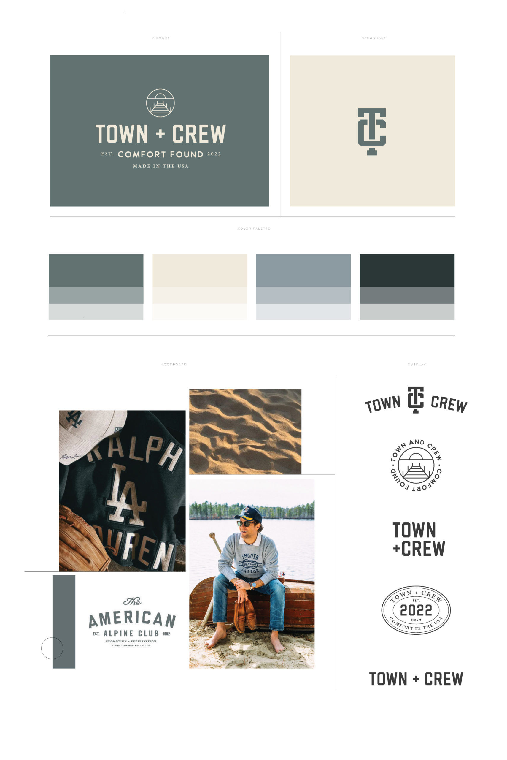
Through the brand discovery process, we found that we wanted to establish the brand as a classic brand for everyone. We wanted to showcase “clothing that represents a blend of nostalgia, athleticism, coastal comfort, and an all-American aesthetic”.
The Brand words we discovered through this process were:
Classic
Coastal
Comfort
Varsity
Refined
Nostalgic
As brand words, brand messages, and brand purpose is created, we dive into visuals and color.
MOOD BOARD
Mood boards capture the essence of a brand. We use these to launch our creative brainstorming to really get a feel of what we want to create. Images that collectively give an overall vibe or feeling help us understand the type of emotion we want to help portray with branding.
Images Sourced from Pinterest.
BRAND COLORS
For colors, the coast became a big inspiration for Town + Crew. The client mentioned this color inspiration during our discovery process: “ Marry the two worlds of coastal comfort + American athletics with a hint of modern edge.” We combined smokey blues and greens with a nice beige/sand tone.
HANDS ON
We combined beautiful aesthetics throughout and paired them with different typefaces. Our favorite being a textured sans serif, a classic athletic sans serif, and a traditional serif for that hint of refinement. We also felt as if an illustration would be a great visual for the descriptor “Comfort Found”. This thin-lined and rounded illustration is one of our favorites.
THE FINAL CONCEPT
After the final touches, Town + Crew came together. We are in love with the All-American and comfortable feel that this brand emanates.
XO, The Honor Team
