Senza Spirits is a comprehensive online resource for a sophisticated alcohol-free lifestyle and products. They develop content, tools, and products for a life without alcohol. You can still enjoy health, celebrations and travel while staying alcohol free.
CONCEPT
“Senza” is an Italian word meaning “without”. They wanted to get the message across with their brand that life without alcohol does not mean living without. We wanted this brand to be bale to connect people with a refined and beautiful experience.
THE BRANDING PROCESS
A brand is not just a logo. It is an emotional connection with your audience. It represents the values, services, ideas, and personality of your company, and we have to get to know you so we can convey the soul of your company in an honest and compelling way. During our discovery process, we discovered these brand words for this brand:
Natural
Complex
Refined
Spirited
Beautiful
MOOD BOARD
Mood boards capture the essence of a brand. We use these to launch our creative brainstorming to really get a feel of what we want to create. Images that collectively give an overall vibe or feeling help us understand the type of emotion we want to help portray with branding. With Senza Spirits we really wanted to capture the feelings of refinement and natural. We did this by capturing movements of earth and pairing with an elegant image of a glass.
BRAND COLORS
A comprehensive color palette should support your brand message. To keep the brand natural we knew we wanted to use more earth tones but paired with light neutrals. We loved the pairing of blues and greens that allude organic and healthy energy while still being unique.
HANDS ON
For this typography, we created custom lettering to set Senza apart within their market. With rounded edges and bold shaping, we created letters that flow into each other beautifully. We paired this customized sans serif with a lowercase modern serif for the descriptor.
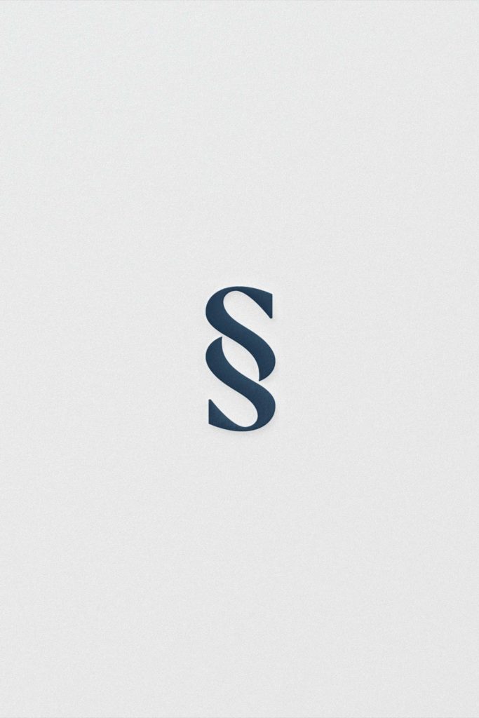
For their secondary mark, we wanted the “SS” to represent Senza Spirits. To match the aesthetic of their primary letters, we created the SS to flow into each other.
FINAL CONCEPT
After the final touchups with our custom lettering, we created the final brand for Senza Spirits. We love how this brand turned out and we are so excited to get to watch it come to life.
XO,
The Honor Team